There are color combinations that feel strategic.
Black and white: deliberate.
Red and pink: flirtatious.
Camel and cream: curated.
And then there are combinations that feel… inevitable.
Blue and green belong to that second category.
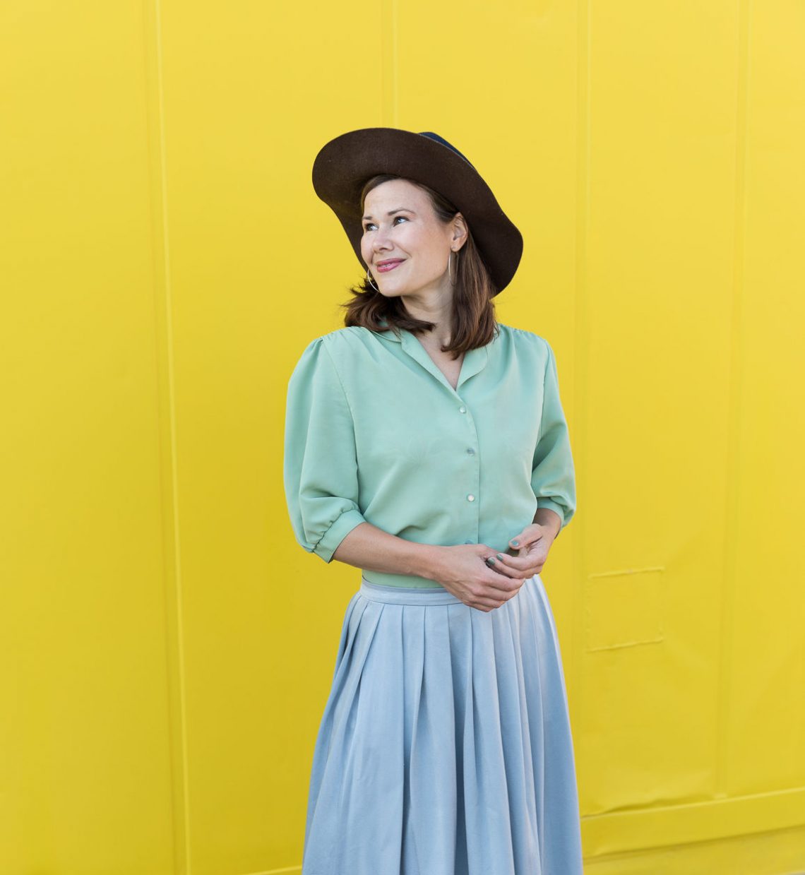
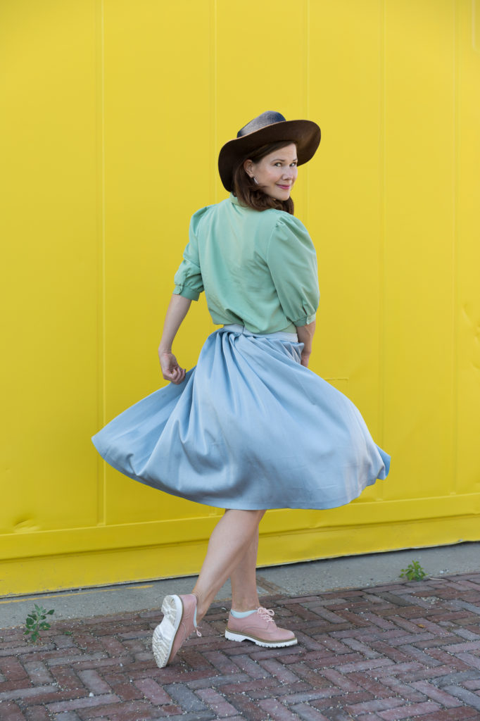
The first time I saw them styled together in a way that stopped me mid-scroll, it wasn’t loud. No neon clash. No editorial theatrics. Just a silky mint pleated skirt paired with a soft, pastel blue blouse. The tones were gentle. The silhouette uncomplicated. But something in it felt instinctively right.
Not trendy-right.
Elemental-right.
I remember thinking: why does this work so effortlessly?
And then — because I can’t help myself — I needed a theory.
Not a Pinterest theory. A deeper one.
Because certain color pairings don’t just flatter. They resonate.
Blue and green don’t argue with each other. They don’t compete for attention. They coexist.
And coexistence, aesthetically speaking, is rare.
The First Stylist Was Not a Stylist
We talk about “unexpected” color combinations as if fashion invented them.
But long before mood boards, long before Pantone forecasts, long before influencers whispered the next big palette into our collective consciousness, there was something else quietly orchestrating color harmony.
The horizon.
Look at it.
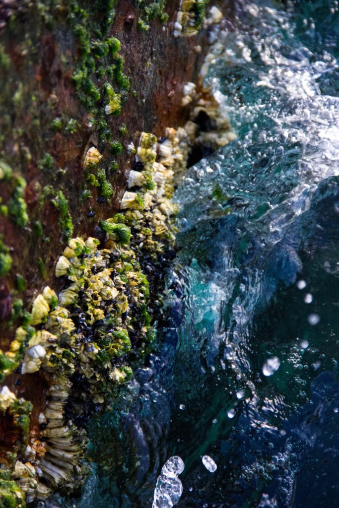
The green of a field dissolving into the blue of sky. The sea folding into distant hills. Moss against a glacier lake. Seaweed suspended in salt water.
Blue and green are not adjacent in nature occasionally. They are adjacent constantly.
We have grown up with that adjacency embedded in our visual memory.
Which means that when we see a mint skirt against a powder-blue blouse, our brain does not panic.
It relaxes.
Because somewhere in the back of our evolutionary consciousness, that pairing signals safety. Stability. Open air. Living terrain.
Nature was the first to wear blue and green together.
Fashion is only catching up.
A Short Cultural Detour: Why This Pair Once Felt “Wrong”
For decades, many people grew up hearing a strange rule: “Blue and green should never be seen.”
Where did that even come from?
The phrase is old — likely Victorian — and like many Victorian style codes, it tried to impose moral order onto aesthetics. Color combinations were treated almost like social etiquette.
Blue and green together were considered clashing. Perhaps too close on the color wheel. Perhaps insufficient contrast. Perhaps simply unfashionable in certain industrial dye eras.
But fashion rules often say more about the anxieties of their time than about the colors themselves.
Industrial dye production in the 19th century introduced new, vivid pigments that sometimes clashed harshly. Early synthetic greens could appear acidic; certain blues felt dull by comparison. Without tonal harmony, the pairing could look discordant.
But technology evolved.
And more importantly, taste evolved.
Today we understand color less as rigid hierarchy and more as spectrum.
Blue and green are neighbors on the color wheel — analogous colors. They share undertones. They blend naturally. When matched in intensity, they create flow rather than friction.
The old rhyme lingers as a ghost of aesthetic conservatism.
But ghosts rarely survive long under daylight.
Why Blue Soothes and Green Grounds
There is psychology here.
Blue has long been associated with calmness. Stability. Trust. It is the color of depth — sky and sea. It recedes. It creates space.
Green is balance. Renewal. Growth. It sits at the center of the visible spectrum. Our eyes process it comfortably, with minimal strain.
Put them together, and something interesting happens.
Blue opens.
Green anchors.
Blue expands.
Green stabilizes.
The combination feels like breathing in and planting your feet at the same time.
It’s no coincidence that wellness spaces lean heavily into these hues. That mental health research often points toward the benefits of time spent in green landscapes beneath blue skies.
There’s even evidence suggesting that regular exposure to natural environments — even small rituals like tending plants — can reduce stress markers and improve cognitive function.
We crave green and blue not because fashion tells us to.
But because our nervous systems recognize them.
Wearing them becomes a kind of portable landscape.
The Question of Balance
Of course, not every blue and green pairing feels transcendent.
Tone matters.
Intensity matters.
Proportion matters.
A neon green against an electric cobalt might scream rather than sing. But a muted sage with a dusty cornflower? That’s harmony.
When colors share similar saturation — both soft, both rich, both deep — they feel intentional.
I once wore a deep forest-green wool coat over a navy knit dress. The difference between the two hues was subtle, almost meditative. People couldn’t always articulate why it looked cohesive.
But they noticed.
Balance can also be achieved through a third color.
Yellow, for example, sits between blue and green on the spectrum. Introduce a subtle mustard bag or warm-toned shoes, and the palette feels complete — like sunlight filtering through leaves.
The math is simple: yellow plus blue makes green. The colors are in conversation already.
You’re just facilitating it.
Blue and Green Across History
Color has always carried symbolism.
In medieval Europe, blue was once expensive — ultramarine pigment derived from lapis lazuli was rarer than gold. It adorned sacred garments in religious art. It signified divinity and depth.
Green, meanwhile, often symbolized fertility and life — but also unpredictability. In some traditions, green garments were associated with the supernatural.
Together, they held tension: heaven and earth.
In Islamic art and architecture, green and blue frequently appear in tilework and mosaics — colors reflecting paradise, water, and spiritual infinity.
In East Asian landscapes, ink paintings often rendered mountains in muted green against expansive blue-grey skies — harmony between terrain and atmosphere.
These colors have traveled together through centuries of visual culture.
Fashion didn’t invent the pairing.
It inherited it.
Wearing the Combination Without Looking Literal
The risk, of course, is leaning too heavily into the metaphor.
Green skirt, blue blouse, brown sandals — suddenly you look like a children’s book illustration of “outside.”
The trick is restraint.
Texture helps.
A silky mint pleated skirt feels entirely different from a grassy cotton one. A structured cobalt blazer reads sharper than a beachy linen shirt.
Silhouettes matter too. Tailoring adds sophistication to what might otherwise feel pastoral.
One of my favorite combinations is teal trousers with a powder-blue oversized shirt — both cool-toned, but not matchy. The slight difference in depth creates dimension.
Another is a navy coat over a sage knit dress, finished with black boots. The darkness of navy anchors the softness of sage.
Blue and green don’t need to be bright to work.
In fact, they often shine most in their muted forms.

The Mental Shift: From Matching to Flow
For years, fashion taught us to match.
Shoes to bag. Belt to bag. Exact shades aligning like military units.
But blue and green invite a different mindset.
Flow instead of match.
Think of watercolor bleeding gently from one shade into another. Think of coastal landscapes where sea merges with horizon and you can’t pinpoint the line.
When styling, that might mean layering different blues and greens within one outfit. A soft mint knit over a darker teal skirt, finished with a navy coat.
It becomes tonal rather than binary.
And tonal dressing feels inherently modern — less rigid, more intuitive.
Nature as the Original Influencer
We scroll endlessly for inspiration.
We save mood boards.
We chase seasonal palettes.
And yet, the most consistent stylist remains outside.
Take a walk on a clear day.
Notice how the sky shifts from pale blue near the horizon to saturated cobalt above. Notice how trees aren’t one green but dozens — sage, moss, emerald, olive.
Nature does not obsess over exact shade matching.
It plays within a family.
Perhaps that’s why blue and green together rarely feel forced. They’re rehearsed daily by landscapes across the planet.
We’ve been absorbing that rehearsal our entire lives.
Sustainability, Memory, and Color Longevity
There’s another quiet advantage to this pairing.
It ages well.
Trend cycles often pivot around extremes — hyper-saturated brights one year, monochrome minimalism the next. But blue and green exist in the middle ground.
A vintage navy coat bought six years ago still works with a newly found mint blouse. A secondhand emerald skirt feels fresh when paired with a contemporary sky-blue knit.
Because the combination isn’t trend-dependent.
It’s structural.
When building a wardrobe with longevity in mind, anchoring around palettes that nature rehearses repeatedly feels strategic.
You’re less likely to tire of them.
They feel perennial.
The Physical Boost Is Not Imaginary
I hesitate to romanticize clothing too much.
A blouse cannot cure anxiety. A skirt cannot solve existential dread.
But color does affect perception.
When I wear blue and green together, I notice something subtle: I feel steadier.
Perhaps it’s placebo.
Or perhaps it’s the accumulated memory of landscapes — lakes and hills, forests and open skies — whispering familiarity.
In winter, pairing a deep teal sweater with forest trousers feels grounding.
In spring, mint with sky blue feels hopeful.
The combination adapts to season without losing its essence.
And that adaptability feels… human.
Breaking the Rule (Quietly)
If you grew up hearing that old rhyme — blue and green should never be seen — consider this your permission slip.
Fashion thrives on rule-breaking.
But the most satisfying rebellions are the quiet ones.
You don’t need neon contrast or avant-garde styling to make a statement. Sometimes, pairing two colors that were once considered incompatible is rebellion enough.
And when that rebellion feels as natural as a horizon line?
Even better.
Where I’ve Landed
Blue and green are not dramatic together.
They don’t shock.
They don’t scream.
They breathe.
They expand.
They steady.
They remind us that some combinations predate us — that harmony often exists before we intellectualize it.
When I put on a sage skirt with a powder-blue shirt, I don’t feel trendy.
I feel aligned.
Aligned with something older than fashion cycles.
Older than rules.
Older than rhyme.
The sky and the earth have been wearing this combination forever.
We’re only just remembering that we can, too.